Introducing our navigation redesign
September 23, 2020
Today we’ve launched a reasonably large redesign of our site’s navigation.
Why a redesign? Because our site has grown complex over the years, and it had become a bit unwieldy. Soundslice has a lot of different audiences these days — teachers with students, our community, our store, our embedding customers and people using our notation editor for self-study among other purposes.
In our old design, some of these audiences were served better than others. And it was difficult for new users to understand all the stuff Soundslice can do for them.
So here’s what we’ve changed —
New sidebar for logged-in users
If you’re logged into Soundslice, you’ll now find that most pages have left-hand sidebar navigation:
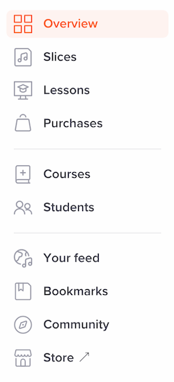
This gives you quick access to the various things you might want to do — and it helps communicate the things you can do on Soundslice if you didn’t know about them yet. It also changes the feel of the site in a nice way, making it more unified and “appy.”
If you’re on a device with a smaller screen, you can access this sidebar menu by clicking the “hamburger” icon at upper left.

New Overview page
When you log into Soundslice, we’ll now take you to a new Overview page. It looks like this:

This new page gives you quick access to a bunch of things:
- Your most recently edited slices
- Your most recently bookmarked slices
- Your most recently joined private courses (if you’re using Soundslice with a teacher)
- Your most recently purchased courses from our store
- The latest posts from people you follow in our community
We’ll only show you the sections that you’ve actually used on our site. For example, if you’ve never bought anything from our store, you won’t see a purchases section in the Overview page.
Previously, when you logged into Soundslice, we took you to your feed — the latest posts by people you follow in our community — whether you followed anybody or not. Now, the Overview page features the latest four posts from people you follow, and you can click Your feed in the sidebar to access the whole feed.
New slice manager design
The slice manager, which lists all the slices you’ve created, has gotten a nice visual refresh.
Aside from some aesthetic changes — such as tighter spacing, new icons and different typography — it also works a lot better on mobile and touch devices.
Quicker workflow for importing
Both the Overview page and the slice manager now have a new Import button:

This saves some time for common workflows, such as importing a MusicXML file or transcribing a YouTube video.
Unified global search button
If you’re logged in, you’ll now see a prominent search box on nearly every page of the site. This will let you search either your own slices or community posts — you decide when you search, by selecting the appropriate option:

Previously, if you wanted to search your own slices, you had to go to your slice manager first. Now, you can search your own slices from many other parts of the site.
New navigation and design for the store
The Soundslice store has a new look. We’ve given it a bespoke header, to communicate that this is really a standalone thing.
We’ve made various improvements here, such as including a consistent link to “Your cart” in the upper right, tweaking the navigation and providing quick access to your purchases.
New navigation on slice pages
When you’re viewing a slice, you’ll now get a contextual Back button at upper left, depending on where you accessed that slice from. For example, if you accessed the slice via your bookmarks, it’ll say “Your bookmarks.” If you accessed it from via your feed, it’ll say “Your feed.”
The header is also a bit smaller — providing more vertical space for the slice’s music itself.
We have some further plans here, too. Now that the slice page’s header has been cleaned up, this gives us a place to put other slice-specific controls in a consistent way. Stay tuned.
Notification icon always visible
When you’re logged in, you’ll now always have access to your notifications via the bell icon in the upper right of every page.
Previously, this notifications page was buried in the “Your feed” page and many people didn’t realize it even existed.
Note that we don’t actually change this icon’s display based on whether you have any notifications. We might do that someday, but for now you’ll need to click the icon to see the notifications.
No changes for embeds
If you’re using our Licensing plan to embed Soundslice on your own site, it will continue to look and work exactly the same way. Nothing has changed in our embedded player.
Feedback?
We’d love to hear your thoughts on these changes, plus any other suggestions you might have.