Introducing the new Soundslice player
August 1, 2019
We’re excited to announce we’ve redesigned our player!
It still has all of the music-learning and practice tools you’ve come to love — now with a fresh design, to make things easier and more intuitive. These changes are all based on feedback we’ve received since our player was launched in 2014.
Here’s an overview of what’s new. We hope you love it.
Visualizations are easier to discover
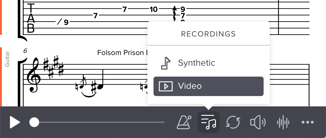
In our previous design, the “Visualizations” (Fretboard, Keyboard, Mixer and other tools) were all combined behind a single button:
This was nice and compact, but it meant these features were quite hidden: you had to know to click the small double-arrow icon to show the menu. We got lots of feedback from people who didn’t even know these visualizations existed.
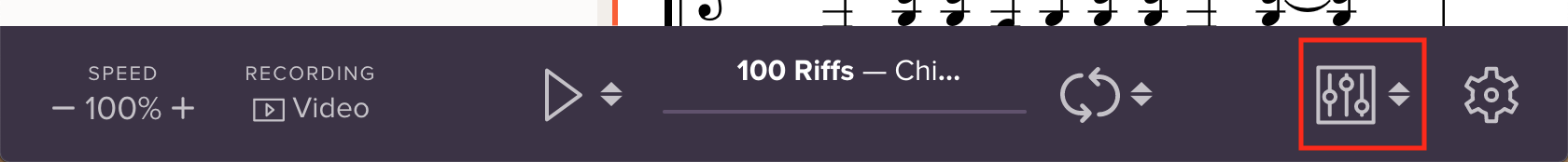
In our new design, all visualizations are available directly from the controlbar, making them much easier to discover:

This change also opens the door to exciting features in the future. For example, many customers have asked us for the ability to put “View full screen” and “Print” icons directly in the controlbar. We’re planning to make that possible in a future update.
Much better layout at smaller widths
In our previous design, important features like the speed controls, recording toggle and visualizations were hard to discover at smaller screen widths, because they were hidden behind the Settings icon:

In our new design, more controls are available when the player is embedded at smaller widths. This means less clicking and faster access:

At even smaller widths, the new design still keeps the speed and recording controls available. We use icons for these controls at smaller widths (instead of text), ensuring they have enough space:
Changes to the Mixer
Previously, the Mixer contained per-track volume and appearance controls (a way to show/hide notation, chords, lyrics, etc). The tools themselves were great, but some students struggled to understand the metaphor of a “Mixer” and why the various tools were grouped together.
Our new design keeps all the functionality of the Mixer but groups the features in (we hope) a more understandable way.
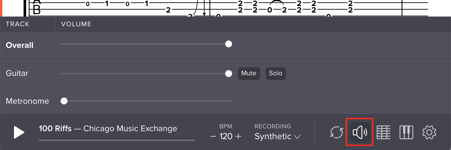
1. Consolidated volume controls
Our player has three volume controls: per-track volume, metronome volume and overall volume. Previously, these three volume controls lived in three different places:
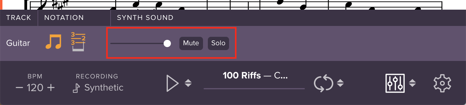
Our new design consolidates all volume controls into a dedicated volume panel, accessible directly from the controlbar:
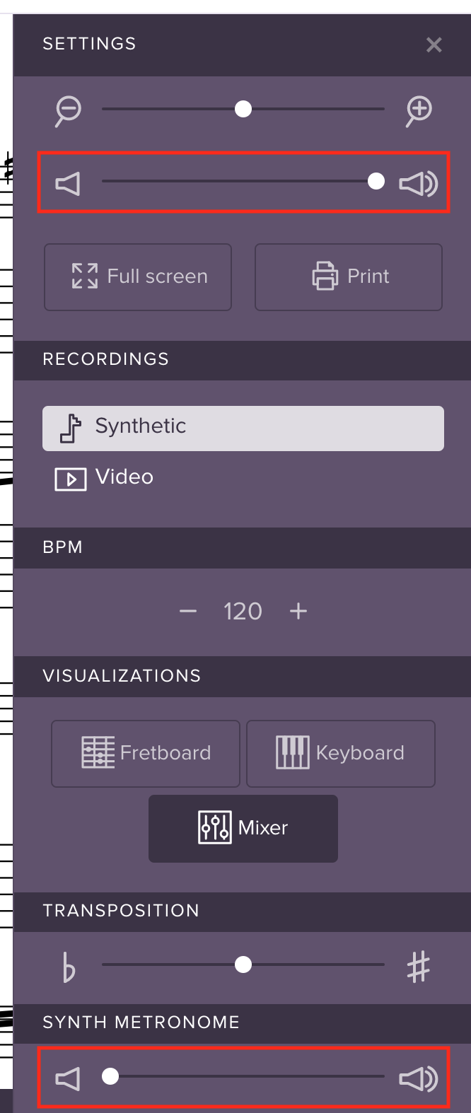
2. Consolidated appearance options
In our previous design, track appearance options (showing/hiding notation, chords, lyrics, etc) lived in the Mixer along with the volume options:
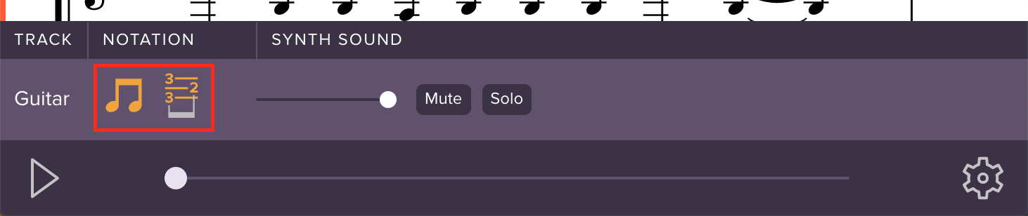
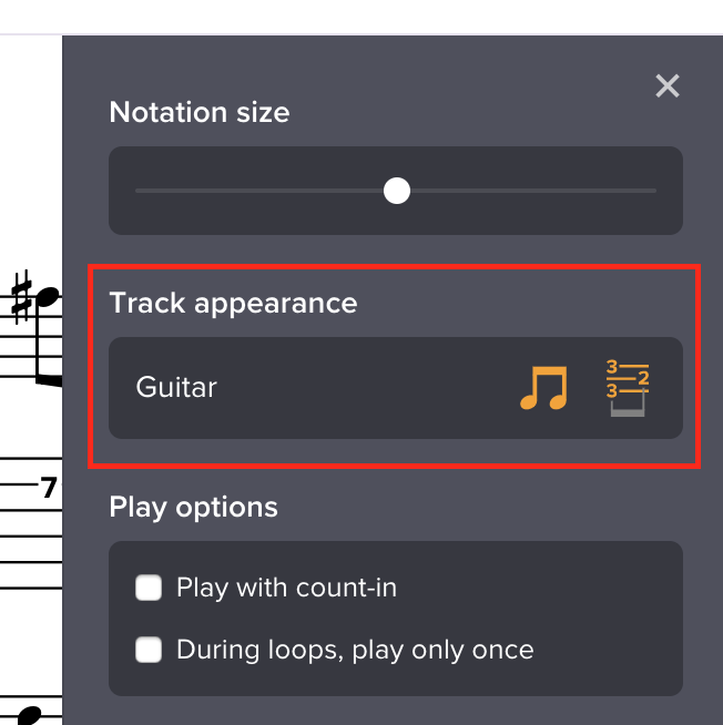
Now, these options live in the Settings sidebar, alongside other appearance-related controls:
Easier-to-find play controls
For a while now, we’ve offered two features that let you control playback:
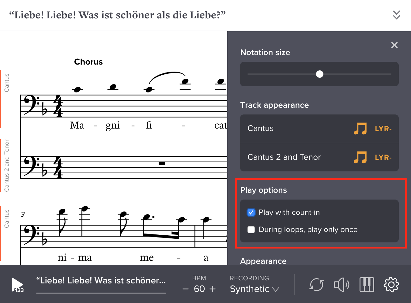
- “Play with count-in” — adds a metronome count-in each time you press Play
- “During loops, play only once” — changes playback so that, if you’ve selected a loop, the music will only play once
Problem was, these features were hard to find, because they were located in menus behind small arrow icons next to the play and loop buttons respectively.
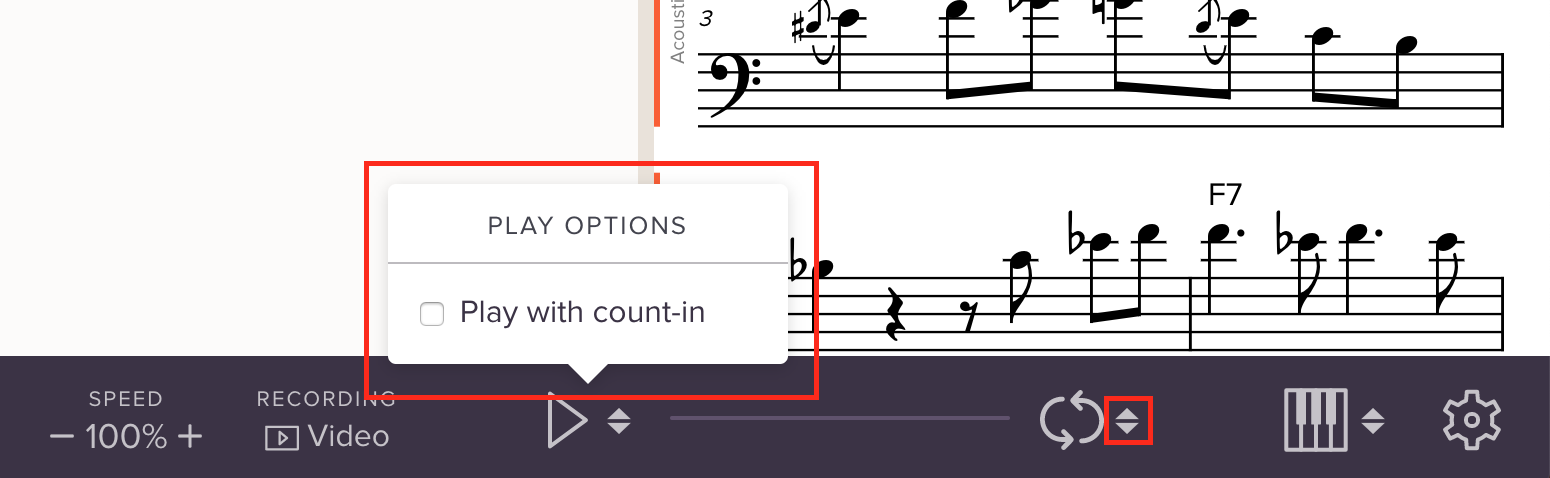
In our new design, we’ve removed those small arrow icons and added a “Play options” section to the settings menu. Much clearer and easier to find!
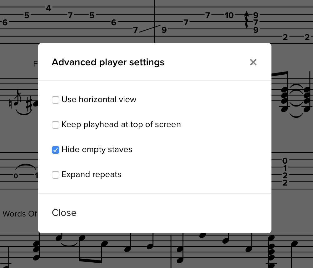
Easier-to-access advanced settings
In our previous design, the “Advanced settings” lived in a separate modal menu, accessible by clicking “Advanced...” in the Settings panel. These were quite hidden, and lots of people didn’t know about them:
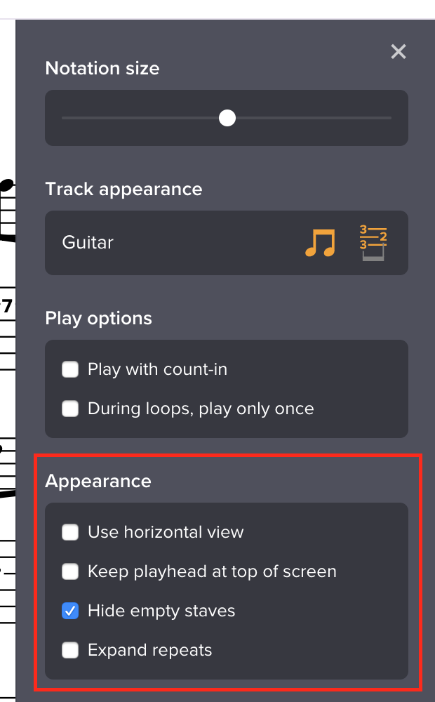
Now, these are always available in Settings, alongside other appearance-related controls:
More fully collapsed sidebar
If you’re taking a Soundslice course or viewing a post on somebody’s channel, the player has always had a sidebar to the left, with information about the slice.
In our previous design, when you collapsed this sidebar to get rid of it, we still displayed a thick vertical bar at left, to indicate the sidebar was collapsed:
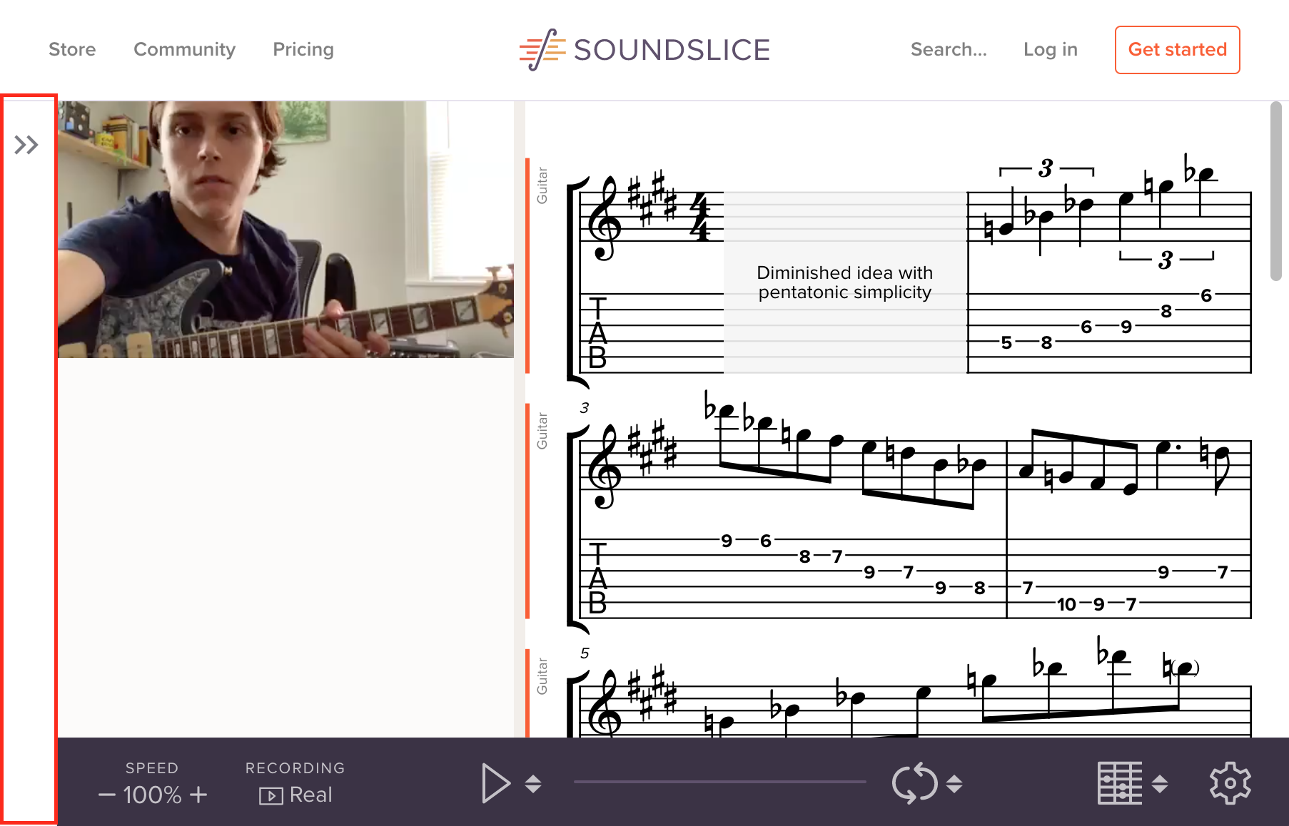
In our new design, we’ve removed that collapsed sidebar. We realized it was taking up valuable space that would be much better used for the main learning interface. Now, after collapsing the sidebar, you’ll find a little button directly within the controlbar:
New visual design
Beyond these improvements in functionality and organization, we’ve made many tweaks to the player’s visual design — from refreshing various icons to polishing typography, colors and layout. It’s nothing revolutionary, but the improvements help make the player feel fresh and modern.
Importantly, our new design lays the groundwork for more customization ability. In the future, we’ll add ways for you to customize the player’s look and feel even more.
Feedback wanted
This redesign is now live everywhere on Soundslice, including embeds.
We’d like to thank all of our licensing customers who were testing the redesign over the last month. Do you have any thoughts on the redesign? Or ideas on what additional changes we can make? We always love to hear from people, so leave a comment below or get in touch.