Better notation spacing for piano music
June 11, 2020
Here’s the latest in our steady stream of improvements to how music is displayed on Soundslice. We now put staves much closer together, using vertical space more effectively and making it easier to read.
Previously, each staff had its own vertical area, and no other staff’s notes were allowed in that space. Here’s an example of our old behavior, in which I’ve manually added a dashed line to indicate our system’s internal “border” between the staves.
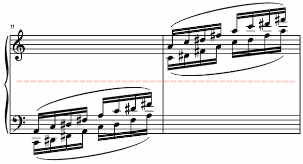
As you can see in these screenshots, this approach is too conservative. There’s way too much vertical whitespace there, and you can’t help but think, “Couldn’t that bottom staff just be moved up a bit?”
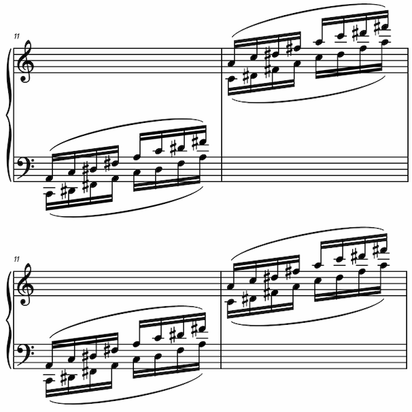
Now, our system no longer has that limitation. We’ve expanded our automatic collision detection algorithms to work across tracks, not just within tracks. (This is a follow-up to the large improvements we made in March.)
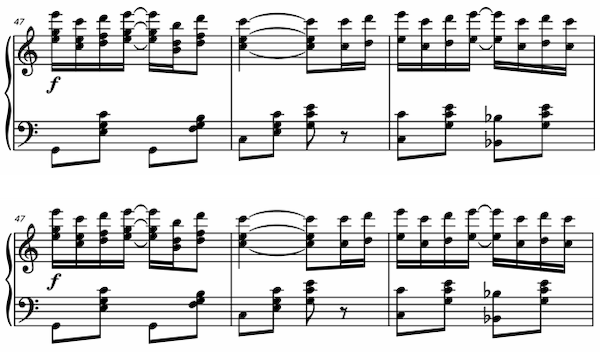
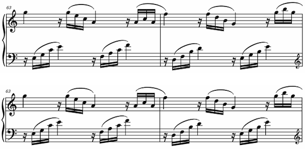
This particularly improves grand-staff piano music. Here are some before-and-after examples:
Because Soundslice is web-based and draws its notation automatically based on your device, you don’t need to do anything to take advantage of these changes. If you’ve created slices, chances are they’ll look a bit better now. Just reload the page, and the new changes will take effect.