Better-looking note ties
September 2, 2014
Over the weekend, we redesigned the note ties in our music notation to look much better and more professional. Here’s a rundown of what changed.
I’ve never been happy with the way Soundslice ties have looked. They were kind of wimpy and chintzy, to be honest. Fortunately, we’ve classed things up quite a bit.
What’s different now? Three things: positioning, aesthetics and edge-case logic. Let’s examine those one at a time.
Positioning of note ties
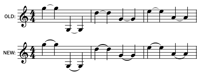
Previously, we always drew ties between noteheads. Now, depending on note positioning, we draw ties above or below noteheads.
The advantage of the older approach was its simplicity in implementation. Regardless of where notes were positioned, the tie would always be drawn in a predictable place. And, in case of chords, it was a safe bet that the ties wouldn’t overlap.
The problem with this approach, though, is that it results in ties that can be a bit too small and lacking definition. Once you account for a tiny bit of margin between the notehead and the tie, plus a couple pixels’ worth of "ramp up" for the curve to expand its thickness, you’re not left with much horizontal space. The less horizontal space for the tie, the less clear and readable it is.
In our new design, we start and end the tie a bit above the noteheads (or below, in the case of notes with the stem up).
This makes for a much more clear and defined tie, especially in cases when the distance between noteheads is small.
For chords, we still put the ties in the middle of the noteheads, as done previously, but they look better due to our aesthetic changes.
Aesthetics of note ties
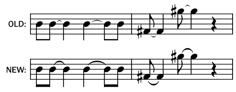
The definitive reference guide to music notation, Behind Bars, is a gigantic (650-page!) collection of strict rules on what you should and shouldn’t do. Its section on ties starts by saying "the design of the tie, the curve and the gradation of the line, is a distinctive component of the appearance of the music."
We’ve tweaked those curves and line gradations to look much better. Our ties are now thicker, smoother and rounder.
Most of the changes here have to do with obscure canvas-drawing commands and math, but one key part of improving them was to consider the tie endpoints. Previously, our ties were pointy and wishy-washy, due to the angles of the curves and the overall tie thickness; now, they still end at a sharp point, but it’s a less gradual gradation.
Edge-case logic
Finally, we’ve improved the rendering logic to handle several more edge cases. The biggest one is that we’re now properly "flipping" ties in the appropriate direction in case of chords (finally!):
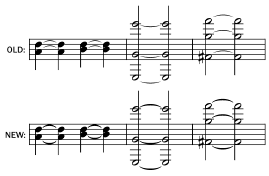
We’ve also fixed tied dotted notes so that the tie is above the note, rather than after the dot, per Behind Bars guidelines.
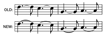
Aside from this, there are a few other edge cases we manually massaged to make the ties look as good as we could. A few edge cases still need design tweaking, most notably the display of very long ties, but we’ll improve these soon.
Feedback
These changes are now live in all our notation, from Pitch Perfect purchases to our partner integrations (for example, Premier Guitar lessons). If you’re curious to see it in action, check out our demo. We’d love to hear your feedback!