Player settings panel redesign
May 23, 2024
Today we’ve launched a redesign of our player’s settings menu — the right-hand panel where you can change various aspects of your music.
Aside from giving it a new look, we’ve polished and simplified various bits to make things quicker and easier to find. Let’s dive in...
The visuals
Our settings panel has had a dark background ever since we launched our player in 2014 — just over 10 years ago! It was high time for a visual refresh. Here’s one last look at it:
Of course, we didn’t want to change just for change’s sake. We had two specific aesthetic goals:
- Change the various controls to be simpler and more straightforward. As the settings panel has grown in functionality over the years, it had become complicated and full of bespoke interfaces that were harder to understand than necessary.
- For people who embed Soundslice in their own websites, use a simpler color palette, so it fits better in a wide variety of contexts.
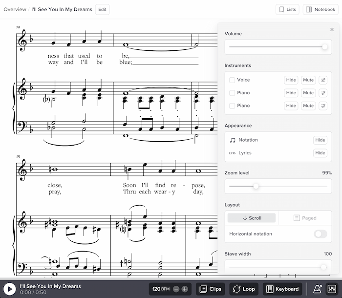
To address these goals, we changed the panel to use a much more muted color scheme (simple gray). And the panel now floats above the music instead of being flush against the edges of your web browser — a subtle change that makes it feel lighter.
Unified volume controls
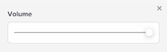
Previously we had a separate volume panel, which had its own icon at the bottom of the player:
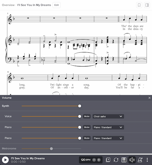
Aside from the main volume, this let you control the volume of individual instruments (in synth playback), plus volume of the metronome and synth overlay.
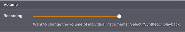
This worked OK, but it was inelegant in a few ways. First, the available options would change based on whether you were using synth playback or a real recording — and we had to add some awkward text to communicate why that was happening:
Second, it took up the whole width of the screen, which was kind of a bad use of space.
In our redesign, we’ve removed that volume panel entirely. The various volume controls now live in context where you’d expect to find them:
1. The master volume is at the top of the settings panel:
(To help people find this, note we’ve changed the icon for the settings panel to something that looks like an audio mixer.)
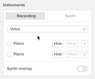
2. Instrument-specific volume (and synth sound) is also in the settings panel, in the Instruments section:
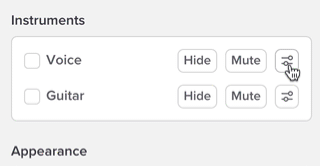
This unifies the instrument-specific display options with instrument-specific audio options. Everything’s neatly in one place.
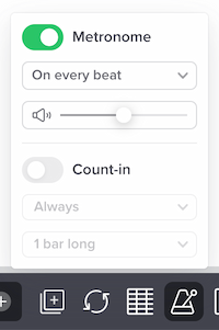
3. Metronome volume is right below the metronome on/off button:
4. Synth overlay volume is directly below the synth overlay on/off button in settings (more on this below).
In theory, it was nice having all of the volumes in one place. But in practice, we find this new approach to be much more practical and nicer to use.
Improved Instruments section
The Instruments section now allows for setting volume and synth sound on a per-instrument basis (see above) — but, as always, per-instrument tweaks are only possible in synth playback, not with a real recording. To help people understand this, we wanted to make it easy to switch between synthetic and real audio directly from this section.
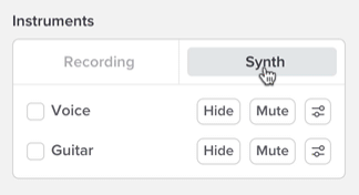
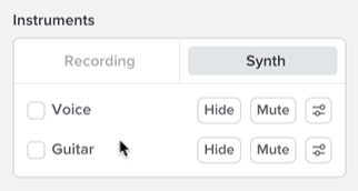
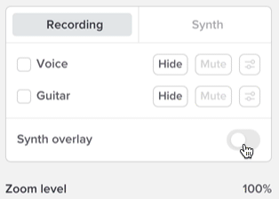
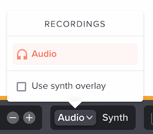
If you’re viewing a slice that has a real recording, you’ll see a quick way to switch between Recording and Synth, directly in the Instruments section:
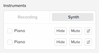
If the slice has multiple real recordings, you’ll see an extra dropdown there, letting you switch between them:
The instrument-specific audio buttons will be disabled if you have a real recording active, and you’ll see a tooltip if you try to use them:
We hope this helps communicate the subtle differences between synth and real audio playback.
Each instrument name is now clickable to instantly focus on it:
This will automatically hide all other instruments’ notation and mute all other instruments’ synthetic playback. You can focus on multiple instruments at the same time, too.
Finally, the Instruments section also now includes a synth overlay toggle, for slices with synth overlay active:
This provides a second way for you to use this feature. The previous way (which we still support) is via the recordings menu at the bottom of the player:
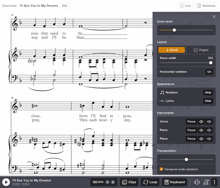
Better organization of layout and stave width
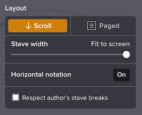
Previously, the Layout section did a lot of heavy lifting. Aside from letting you select the layout, it let you set stave width and line break options:
Now, we’ve split this functionality into two sections:
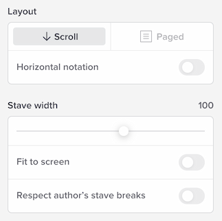
Layout deals solely with layout, and stave width deals with width.
We’ve also added an explicit “Fit to screen” checkbox. Previously this was possible by moving the stave width slider all the way to the right; the new checkbox is much more discoverable.
Smaller tweaks
Rounding out the redesign, here’s what else is new:
- The playhead style section no longer has a show/hide button for the advanced settings. The settings are always visible. (It’s not that much stuff, so the show/hide felt too heavy.)
- The auto-saved settings section takes up much less space.
- In the zoom level, stave width and transposition sections, we now display the current value at upper right. Previously this was only visible via a tooltip while you were interacting with the interface.
- The size of our player (in terms of code your browser needs to load) has gone down a fair bit. The settings panel is lazily loaded, which means your browser won’t load that code until you actually use it.
- If you’re a Licensing customer who has customized your embed colors: please note the settings colors have been hugely simplified. Your existing colors should continue to work well in context of the redesign, but please note that some of the old customizations are no longer relevant due to the simpler design. Feel free to tweak. Note we still need to update our documentation to remove the old customization choices.
We hope you like the redesign, and thanks as always for using Soundslice!