Introducing our player redesign
September 1, 2022
Today we’ve launched the latest iteration in the design of the Soundslice player — with new functionality, a more approachable design and a fresh aesthetic.
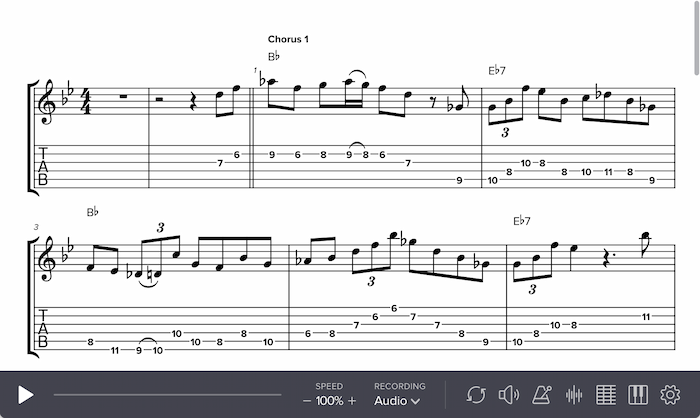
Here’s a quick comparison. First, the old design:
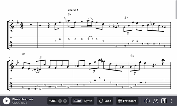
And the new design:
We last redesigned our player three years ago. This design has served us well, but after listening to years’ worth of feedback, we were motivated to make three broad changes:
- Make things more approachable and obvious. Our player has a lot of functionality, and feedback tells us many people don’t realize everything it can do. We set out to make things friendlier, especially for people who are new to Soundslice.
- Optimize the common cases. For some player features, we offered raw power at the expense of simplicity — which meant it took too many clicks to do common tasks.
- Make better use of space. In our old design, the controlbar was dominated by the progressbar, which left relatively little space for all of the other buttons.
Let’s dive into the specific changes...
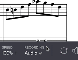
New progressbar
The progressbar (the thing you can “scrub” to quickly move to a certain moment of music) now lives on top of the controlbar. This is significantly wider than before, meaning it’s easier to scrub with more granularity/control.
This is especially improved on mobile devices, where the previous design used a laughably small progressbar in some cases.
This in turn allowed us to make space for...
Clearer buttons for looping and visualizations
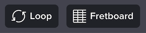
Looping is such a fundamental Soundslice feature that we wanted to make it super obvious. Previously, the Loop button was a simple icon; now we include the text “Loop” — conveniently also making the button’s clickable area bigger.
As always, you can still just drag across your notation to make a loop, but this bigger button should make it more obvious to newer users.
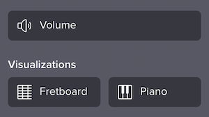
Similarly, we expanded the instrument visualization button, adding the text “Fretboard” (or “Keyboard,” “Violin,” “Trombone” or “Trumpet,” depending on your music).
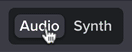
Faster interface for switching between recordings
Being able to toggle between synthetic playback and video/audio recordings is one of the best Soundslice features. But in our previous design, it was hidden enough that some people didn’t even realize it was possible. And even if you knew it was possible, it took a few too many clicks:
Now, it’s a breeze. In the common case — a slice with synthetic playback and a single recording — both options are clearly displayed in the controlbar, and you can switch between them in a single click:
This is especially useful during transcribing.
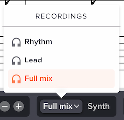
If a slice has multiple recordings, we’ll always display “Synth” (unless you’ve disabled it) and the last-used recording. If you click the recording name, you’ll be able to choose a different one:
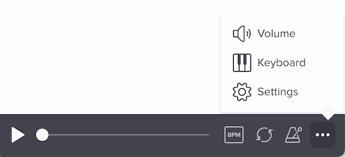
New metronome features
Previously, if you clicked the metronome icon in the controlbar, it would toggle our metronome on or off — and that was it.
Now, clicking it opens a new menu:
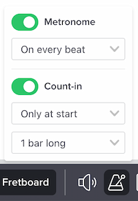
A bunch of things are new here:
- You can now toggle between “On every beat” and “Only on downbeat.”
- The count-in options have been moved into here. Previously they were in Settings, but it makes more sense for this to live in the metronome section.
- You can now specify a count-in “Only at start” vs. “Before each loop.”
- You can now specify the length of your count-in (1-3 bars). Useful for fast tunes!
- If you have a paid plan, we’ll save all of these metronome and count-in settings on a per-slice basis. So if you leave the slice, then return to it another day, you can pick up where you left off. (Previously.)
As a reminder, our metronome plays back on top of your audio — even on real recordings, in which case we use your syncpoint data to determine the metronome hits. Sweet!
More intuitive appearance settings
Being able to customize your notation — say, hiding lyrics, adding stems to tablature or soloing a part — is a core Soundslice feature. Here’s what the Settings section used to look like:
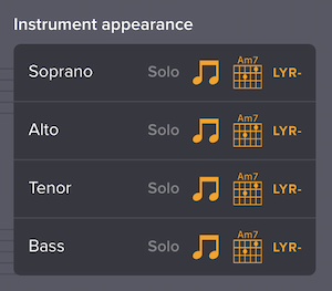
Each of those little icons would let you toggle a specific aspect of notation for a specific instrument. But this felt a bit too granular — few (if any?) people actually need to be able to hide fingerings for one instrument while keeping them for another.
It’s much more natural to think of this as two separate areas: the types of notations, and the instruments. Our redesign makes that split clear:
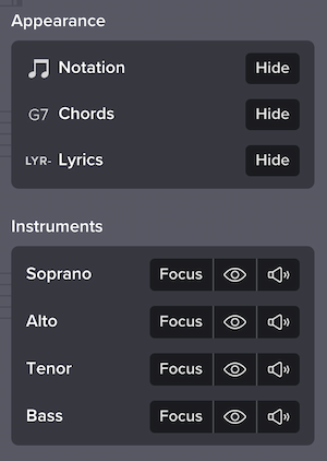
Here, you can quickly toggle off all lyrics, all chords, all tablature, all drum sticking, etc. And you can hide any instrument with a single click — instead of having to realize you needed to hide the individual notations for that instrument one-by-one.
The new “Focus” button automatically hides all other instruments and mutes all other instruments (if synthetic playback is active). This very common workflow now just takes a single click.
As a bonus, this change allowed us to move the “Show pitch names” feature into this area — which feels much more integrated. Previously it was a lonely checkbox floating on its own.
Better organization on small screens
Previously, when viewing a slice on a small screen, we automatically calculated which buttons wouldn’t fit on the screen, and we put them into a separate menu:
This led to an awkward situation if you wanted to open Settings. First you had to open this intermediary menu, then you had to click Settings. It just felt like a hassle.
Now, we’ve removed that intermediary menu and changed Settings to perform that function. So if you’re on a small screen and we’ve run out of space for all the icons, we’ll move them into Settings. Here, for example, we’ve moved the Volume button into Settings, along with the two instrument visualizations:
To better communicate this, we’ve changed the icon for Settings to three dots, instead of the former gear icon. A side benefit: we were using the gear icon in another place to mean a different thing (in our editor, to edit slice settings), so now the icon no longer does double-duty.
Relatedly, we’ve optimized the speed and recording-switcher interfaces to be easier to understand on small screens. Previously they used icons that weren’t as clear as they could be, and now they use a smaller version of the “full” interface:
Notes for embed customers
If you embed Soundslice in your own website/app via our Licensing plan, please note that your embeds aren’t using this redesign yet.
That’s because, for big player changes like this, we have a policy of giving our embed customers a month’s notice, rather than taking you by surprise. This gives you a chance to update any help files, screenshots or other documentation if you choose.
You can opt in to using the redesign by using the new (and temporary) URL parameter new_design=1. See here for info on how to use URL parameters. This gives you a chance to see the redesign with your own content in context of your own site.
We’ll be making the redesign live on all embeds in one month — October 1. At that point the new_design=1 URL parameter will no longer be necessary, and all of your embeds will magically change to use the new design with no effort needed on your part.
Thoughts, feedback?
We hope you like these changes, and we hope you continue to send feedback to help guide what we work on. Thanks, and let us know what you think!